
Which tiers would users choose? Which pricing page converts best? Here is how market research guides you to confident business decisions.
For software and technology companies, the licence tier structure is among the most consequential business decisions the business makes. How features are packaged, what belongs in each plan, and what each tier is priced at directly shapes customer acquisition, retention, and churn.
Conjointly’s Kano Model and Feature Placement Matrix help software teams classify features by attractiveness and map them to the right tier. But once the architecture is defined, a critical question remains: how will users actually respond to it in market?
This article focuses on the next stage, using preference share simulation and pricing page validation to stress-test your assembled tier structure with real respondents before launch, so your subscription model is grounded in evidence rather than assumption.
Identify the most optimal features and pricing architecture through preference share simulation
A/B testing your offering on live users risks real churn and revenue damage, and results take months to be statistically meaningful. Preference share simulation offers a faster, lower-risk alternative, allowing software teams to model multiple subscription structures with real target-market respondents before any pricing or feature change goes live.
Common applications include:
- Evaluating the upgrade or downgrade of software features across tiers
- Testing the introduction of new features into existing plans
- Modelling the addition or removal of a subscription tier
- Assessing the impact of a new pricing structure or billing model
- Understanding how a new competitor entering the market affects your preference share
There are several methodological approaches to preference share simulation depending on your research objectives. One common approach combines monadic testing and Gabor-Granger exercises to isolate respondent reactions to individual pricing scenarios and measure willingness to pay at different price points. The following are examples of the survey flow and outputs.
Example survey flow
The Feature Placement Simulator survey is highly customisable to your specific needs. Here is an example of a five-stage FPS survey.
Stage 1: Screening questions
The survey begins with screening questions to filter potential survey respondents and ensure only the desired audience is redirected to complete the survey. Some commonly used screening questions include demographics, usages, and behaviours.
How would you best describe your usage, or intended future use regarding the enterprise software?
No Use or Plans
Plan to Use
Using
Heavy user
Stage 2: Specific questions related to the software
In the second stage, qualified respondents are normally asked questions about their software usage, such as the number of users needed, storage size, account controls, etc.
How many devices do you need to access the music streaming services?
1
2
3
4
5
6
Stage 3: Sequential monadic tests
Next, respondents are asked to rate the importance of the features to them.
Please consider the following feature regarding the music streaming software
Unlimited data history
How important is this feature for you?
Stage 4: Gabor-Granger exercises
After the questions on feature importance, respondents are asked a series of “would you purchase this product at X price” questions. The prices are randomly selected between a set of minimum and maximum prices. This stage helps in finding the revenue-optimising price points for the software.
Assuming that all the features that are important to you are available, will you consider subscribing to Soundwave Co for your business at $24.99 per month in total for all users?
![]()
Go back
💓Yes
❌No
Stage 5: Additional diagnostic questions
Lastly, the survey ends with additional diagnostic questions, such as gender, location, and current software usage, that help you perform the subgroup analysis for more in-depth insights.
How many people are employed at your company?
1-50
51-200
201-500
More than 500
Which of the following enterprise software are you using?
Software A
Software B
Software C
Software D
Software E
Software F
Brand X
Brand Y
Soundwave Co
None of the above
Example outputs
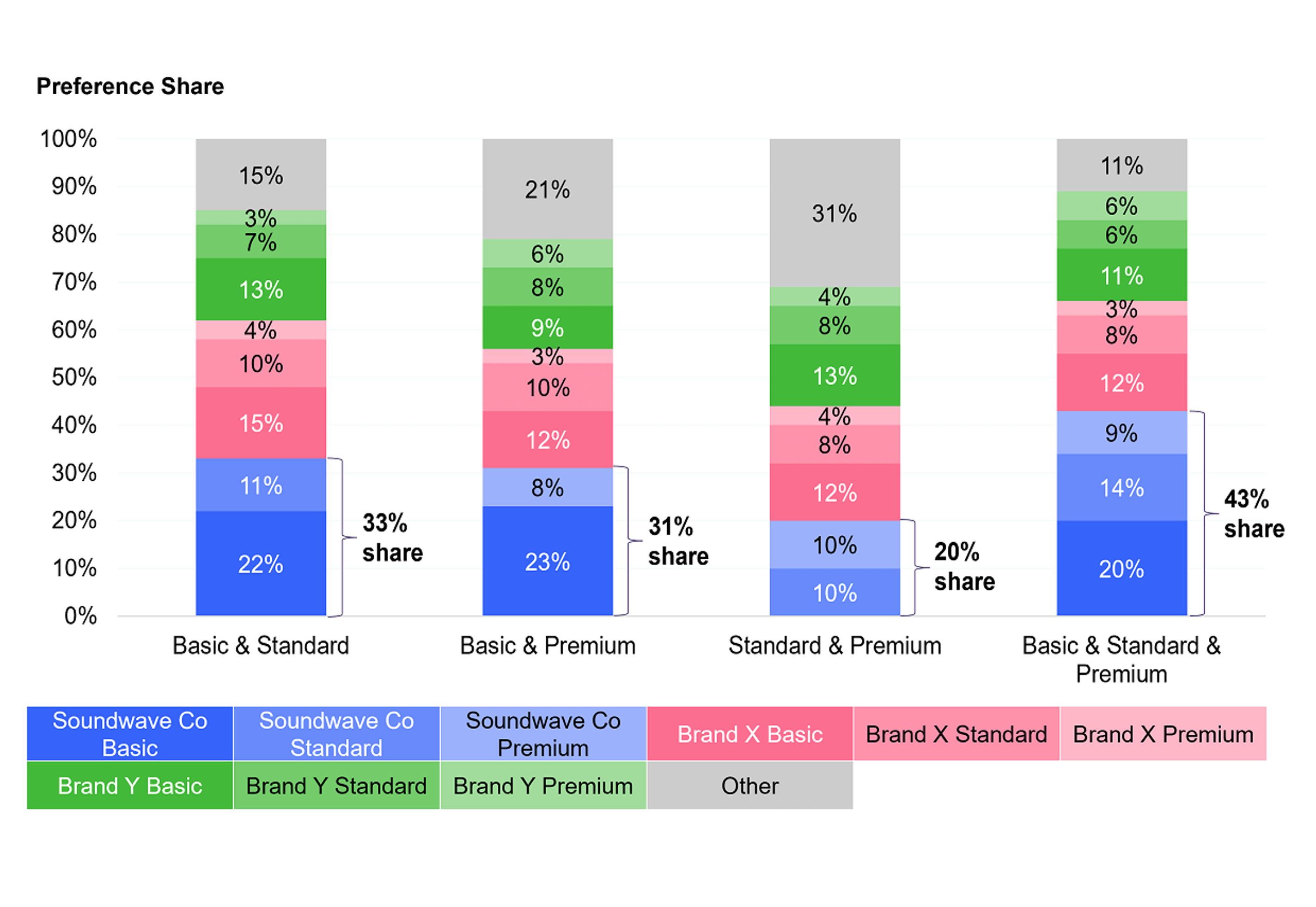
Preference share simulation
The primary output of the simulation is a preference share breakdown across your pricing plans, showing the projected volume share of each tier under different feature and price configurations.

In the example above, a music streaming platform used the simulator to test combinations of basic, standard, and premium tiers. The three-tier structure produced the highest overall preference share, while a four-tier model introduced complexity without a meaningful gain in adoption.
Revenue projection output
Alongside preference share, the simulator generates revenue projections for each scenario, enabling a clear cost-benefit evaluation of pricing decisions before any engineering or go-to-market work begins.

This allows product and strategy teams to move beyond abstract feature debates and ground pricing decisions in projected monetary outcomes. In the Soundwave Co example, the simulation confirmed that a three-tier model maximised revenue and that a four-tier structure, despite higher apparent complexity, would have resulted in lower returns.
Validating your pricing page’s ability to convert
Once your subscription structure is defined, the pricing page becomes the final determinant of conversion. Even a well-designed product offering can underperform if the pricing page itself is unclear, overwhelming, or poorly structured.
Pricing page validation research tests multiple candidate page designs with real respondents, measuring every aspect of the experience that influences conversion.
Common metrics include:
- Conversion rate: the proportion of respondents who select a plan, indicating how effectively the page drives a purchase decision
- Dropout rate: respondents who viewed but did not choose, revealing where friction or confusion causes abandonment
- Preference share and revenue index: projected plan selection and revenue per scenario, quantifying the commercial impact of each page design
- Response time: time taken to select a plan, signalling how clearly the tier differentiation and value proposition are communicated
- Attention and engagement: image heatmaps revealing which elements respondents find most appealing or off-putting, pinpointing where copy, feature lists, and CTAs land or fall flat
Conjointly can tailor the validation test based on your product, tier complexity, and what decisions you need to support. Speak to our research team to discuss your project. Below are illustrative examples of what the survey flow and outputs could look like.
Example survey flow
A Feature Placement Validator experiment consists of three following stages.
Stage 1: Screening questions
The survey begins with screening questions to filter potential survey respondents and ensure only the desired audience is re-directed to complete the survey. Some commonly used screening questions include demographics, usages, and behaviours.
How would you best describe your usage, or intended future use regarding the enterprise software?
No Use or Plans
Plan to Use
Using
Heavy user
Stage 2: Pricing page evaluation
Qualified respondents enter into a split-sample survey. The sample size is based on the number of pricing pages to be tested.
In this example, Soundwave Co wants to test three pricing pages. The survey flow is as follows:

The respondents are asked to evaluate the hypothetical pricing page and choose an option. Throughout the experiment, Conjointly records the respondents’ plan choices, mouse movements, and the duration of time taken to select their preferred plan. Here is an example of an FPV experiment in the respondent view:
Which of the following plans will you choose, if any?
BASIC
$9.90
per month
STANDARD
$13.90
per month
PREMIUM
$17.90
per month
Stage 3: Additional diagnostic questions
Lastly, the survey ends with additional diagnostic questions, such as gender, location, and current software usage, that help you perform the subgroup analysis for more in-depth insights.
How many people are employed at your company?
1-50
51-200
201-500
More than 500
Which of the following enterprise software are you using?
Software A
Software B
Software C
Software D
Software E
Software F
Brand X
Brand Y
Soundwave Co
None of the above
Example outputs
Preference share and revenue projections
As with the simulator, the validator generates preference share and revenue index projections for each page, so you can evaluate not just whether people convert, but which plans they choose and at what average subscription value.

Heatmaps of mouse movement
The validator records respondents’ mouse movements and generates heatmaps for each pricing page, revealing which elements attract attention and which are ignored. This makes it possible to evaluate the effectiveness of calls-to-action, marketing copy, feature lists, and visual hierarchy without relying on assumptions.

For example, if 74% of respondents selecting a business plan hovered over the price and icon at the top of the tier — but rarely scrolled to the feature list below — that is a clear signal about where your copy effort should be concentrated.
Response time analysis
The validator also measures the time respondents take to select a plan. Pages where users deliberate longer often signal that pricing details are unclear, that the tier differentiation is confusing, or that the value proposition is not landing quickly enough. This data allows teams to calibrate the depth of technical detail and simplify tier descriptions where needed.

How simulation and validation work together
Simulation and validation address different stages of the pricing decision process and are most powerful when used in sequence.
Simulation answers the structural question: which combination of features, tiers, and price points produces the best outcome in terms of adoption and revenue? It is most useful before finalising your subscription architecture, when you still have room to adjust what goes in each tier and at what price.
Validation answers the execution question: given a decided subscription structure, which pricing page design converts best? It is most useful once the product plan is set and the focus shifts to presenting it as effectively as possible.
Used together, they close the loop between product strategy and go-to-market execution, ensuring that both the subscription model and the page promoting it are optimised for real user behaviour.
Getting started
Conjointly’s simulation and validation research is fully adaptable to your software offering, competitive landscape, and research questions. Whether you are launching a new product, repricing an existing model, or entering a new market, the approach is tailored to your specific tiers, features, and target users.
Book a call with our research team to discuss a study designed around your needs, or explore how Conjointly supports software and technology companies at our Software and Technology industry page.