To evaluate the effectiveness of the LA Clippers recent rebranding, this blog compares the new 2024 logo to the 2015 LA Clippers logo.
This week saw the LA Clippers unveil their rebranding, complete with a fresh logo, jerseys, and court. As the first rebranding since 2015, this new logo hopes to blend the team’s past, present, and focus on the future in a familiar but elevated look.
Since the announcement, the updated logo and brand look have garnered varying reactions on social media platforms.
BREAKING: The LA Clippers have revealed a new brand identity, including a new logo, jerseys, and court.
— Joe Pompliano (@JoePompliano) February 26, 2024
The rebrand will officially debut next season when they open their new $2 billion arena, the Intuit Dome. pic.twitter.com/yRq2PHiOYa
The LA Clippers have revealed a brand new logo, jerseys, and look for the team. Beyond much needed and a definite improvement. pic.twitter.com/VCJFRLADKF
— Farbod Esnaashari (@Farbod_E) February 26, 2024
Clippers: "Can I copy off your paper?"
— SportsBruiserz (@SportsBruiserz) February 26, 2024
Mariners: "Sure, just don't make it obvious." pic.twitter.com/Yczm1HXzHD
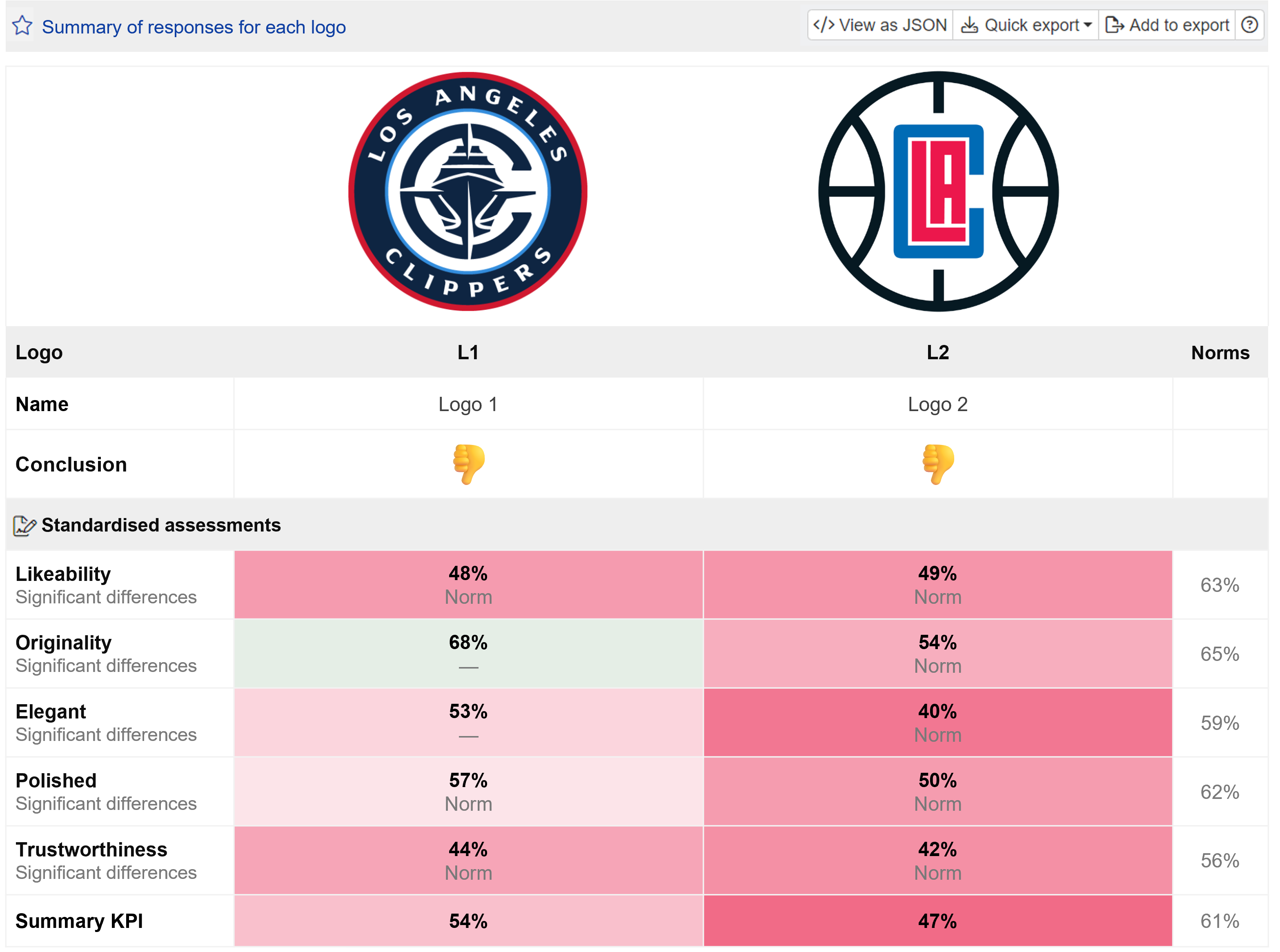
To evaluate the appeal of the new logo against its predecessor, a Logo Test was conducted among 100 US consumers.

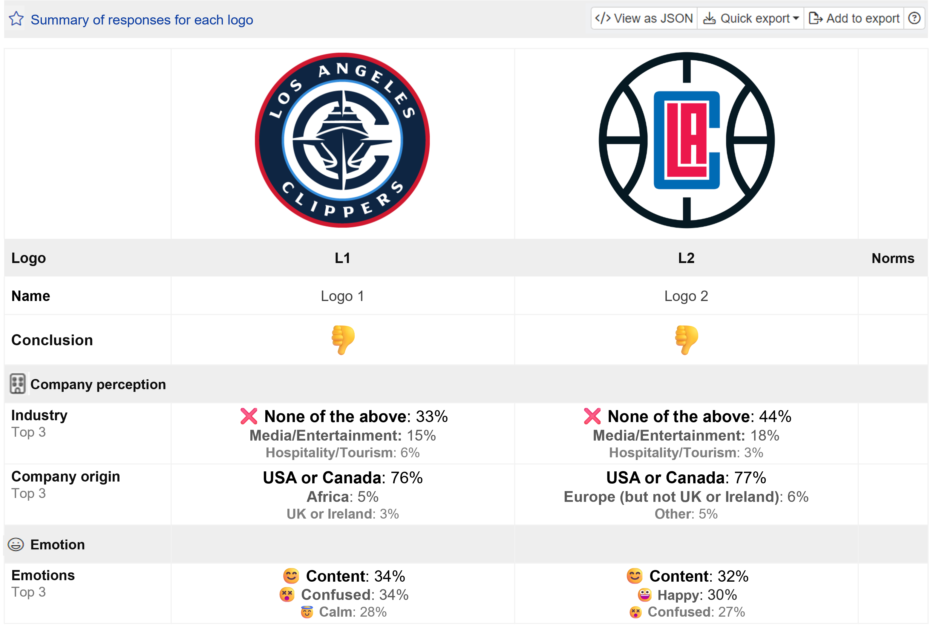
Although respondents rated both logos below average, they generally preferred the new logo, finding it to be more original, elegant, polished, and trustworthy than the previous version. The results indicate that the logo update has improved consumer appeal, though with room for improvement.

Interestingly, a slightly higher percentage of respondents feeling content with the new design, despite an increasing number of respondents expressing confusion about the new logo.

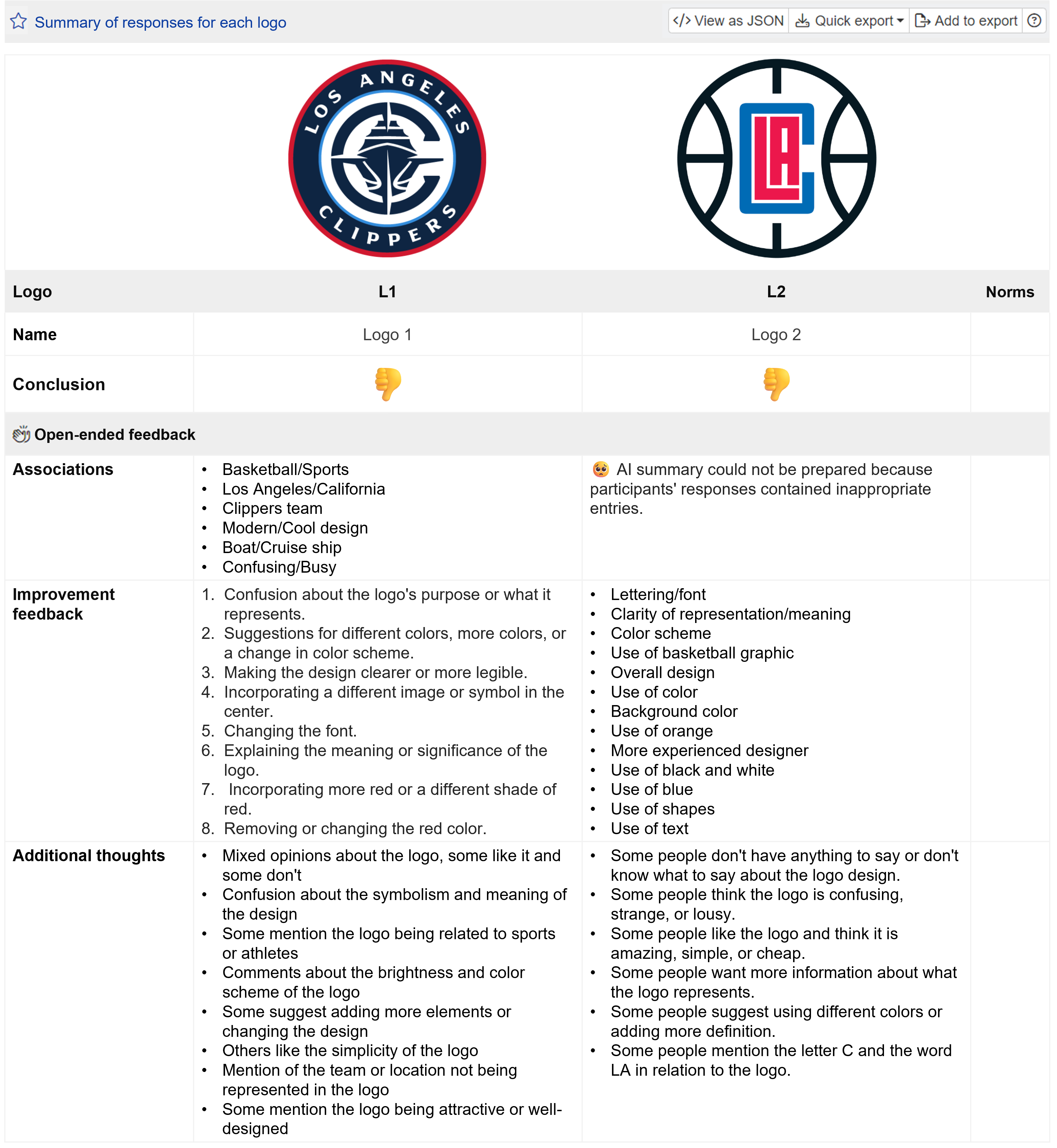
The AI summaries of respondents’ open-ended responses reveal a range of opinions on both logos, indicating that neither logo made an overwhelmingly positive impression with consumers.
Want to see how your logo performs? Launch your own Logo Test now!


