Learn how to create complex crosstabs from survey data using Insights Explorer's LLM-powered interface, with three real-world examples.
Need to create complex crosstabs or visualisations from survey data? This newsletter shows three examples using Conjointly's Insights Explorer.

What is the Insights Explorer?
Conjointly's Insights Explorer is a browser-based R software application with an integrated LLM chat interface.
The Insights Explorer allows you to:
- Work with Conjointly experiments and upload your own data.
- Create custom analyses and visualisations using R functions and libraries.
- Export visualisations for presentations and reports.
With the integrated chat interface, simply describe your analysis needs in plain English, and the system generates the code. Most analyses need a few rounds of refinement, but you'll still get from concept to finished output faster than manual coding.
Example 1: Comparing messaging performance across customer types
A functional food brand compared how six product benefits performed across their ingredient-focused and nutritional value-conscious buyers.
The request: "Create a crosstab showing the lift in top 2 box scores for each of the six product benefits tested, split by respondents who rate ingredients as highly important versus those who rate nutritional value as highly important."

The LLM interface worked through the request iteratively and generated the outputs:

The output can be refined further through the chat interface or exported to Excel for formatting.

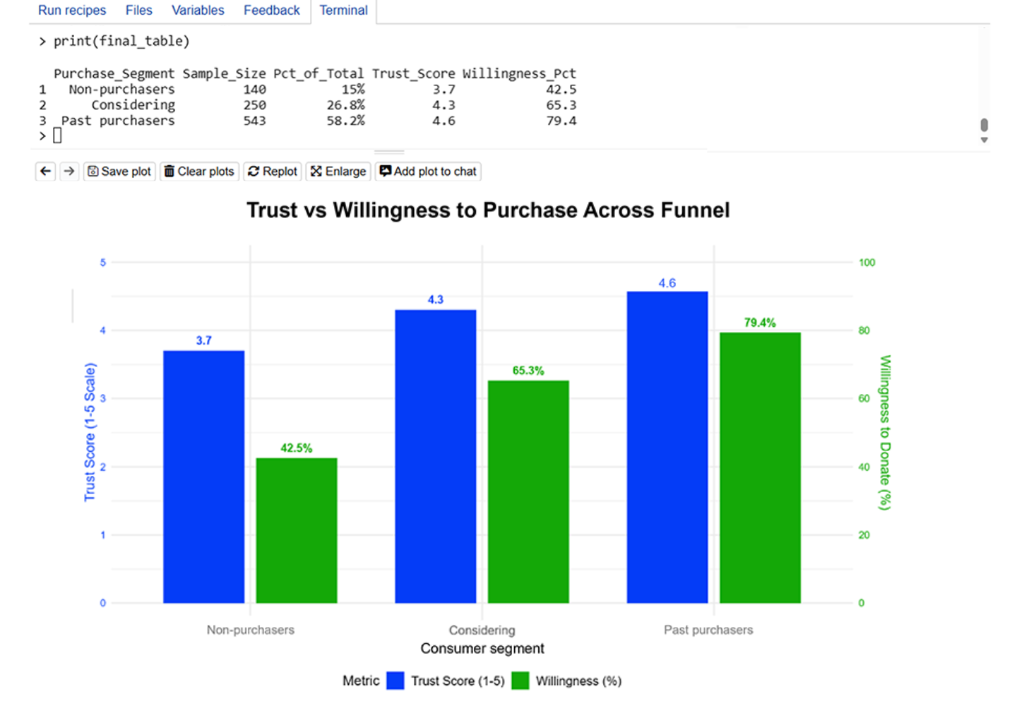
Example 2: Comparing average score versus top 2 box score across segments
Initial request: "Create a crosstab comparing average brand trust score against top 2 box purchase intent across respondents who are non-purchasers, considering to purchase, and recent purchasers in the past 6 months."
After seeing the initial table, the team requested: "Present this as a grouped dual-axis bar chart."

Example 3: Assessing multiple attribute ratings for brands across segments
The request: "Create a crosstab comparing Brand X and Brand Y across tested brand attributes for two segments: respondents with top 2 box Net Promoter Scores for Brand X and Brand Y respectively."
After receiving the outputs, the team decided to present the findings in a side-by-side radar chart.

Get started with Insights Explorer today
Insights Explorer is free and available now in your Conjointly dashboard. The first analysis might take a few iterations to refine, but you'll build familiarity quickly and the process gets faster as you learn what works.